Smart Thermometer Ads
Increase the purchase volume of the Yummly Smart Thermometer IoT device through advertising placement and user interface optimization.
Growth | Research | Ideation
Company
Yummly
Team Breakdown
Product Manager, Engineer Lead, Lifecycle Manager, Content Designer
Duration
1.5 months
Key Roles
Planning, research, strategy, prototyping, testing
Success Metrics
Increase Shopping Cart engagement, Increase subscription
Overview
The Yummly Smart Thermometer is a kitchen device designed to help you cook meat to the perfect temperature with precision. It connects to an app on your smartphone via Bluetooth, allowing you to monitor the cooking progress in real time.
Business Objective
To achieve maximum profitability, Yummly’s parent company, Whirlpool urged the team to pursue ad placements by promoting Smart Thermometer sales on its web and mobile platforms.
Focus Interviews
Conducted 30-minute focus interviews via Google Meet with five Yummly users who purchased the Smart Thermometer to learn about their background, motivation, and pain points to help shape the design narrative.
Customer Insights

User Persona

Design Objective
Identify opportunities to optimize the Yummly Smart Thermometer purchasing funnel to enhance user experience and drive increased conversions.
Design Guidelines

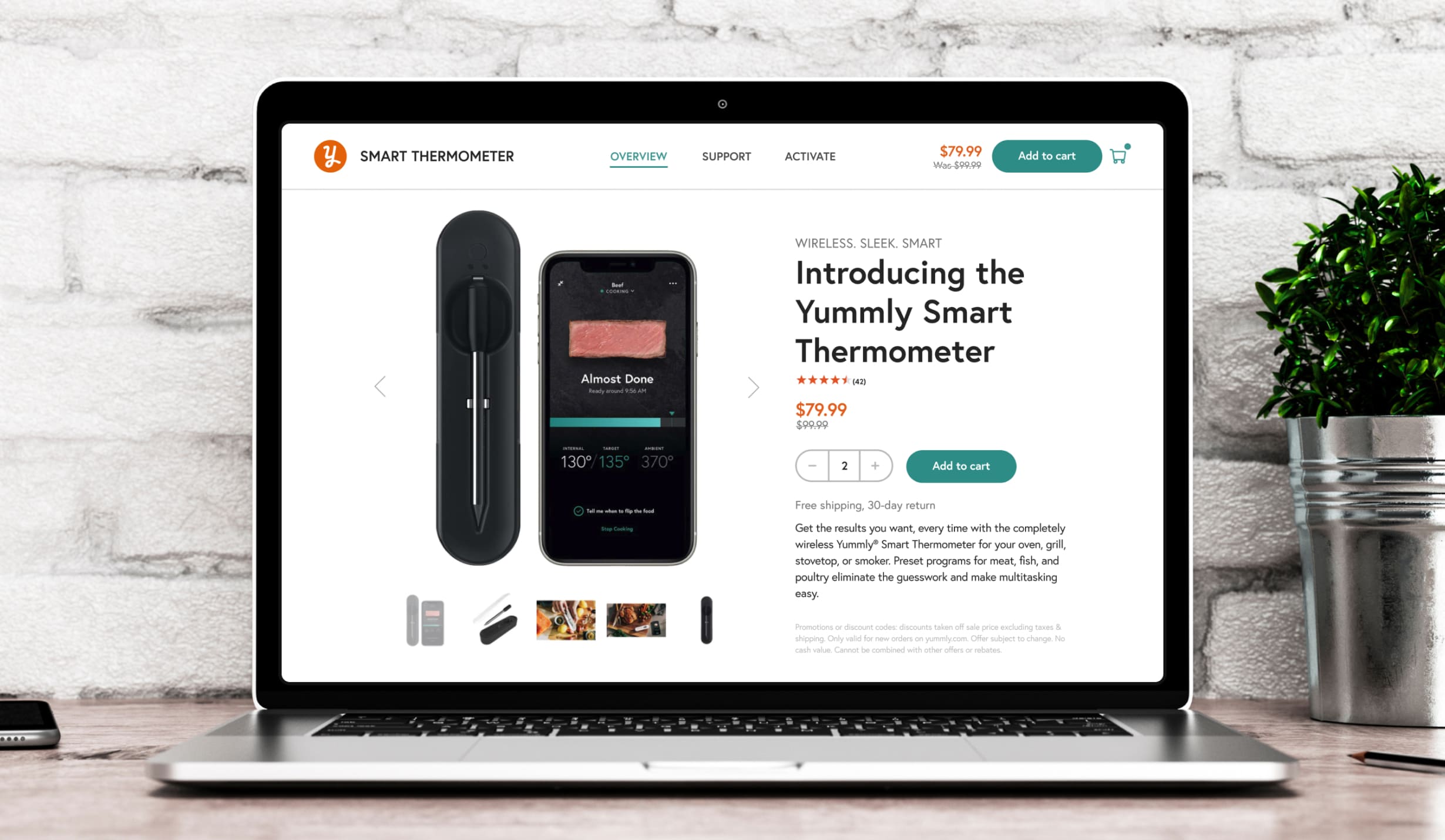
Design - Landing Page Redesign
The thermometer landing page lacked key elements like pricing, an add-to-cart option, and a clear device description, making it difficult for users to make informed purchases and causing drop-offs at the "Buy Now" button. To improve checkout conversions, the product manager and I hypothesized that a more intuitive and streamlined design was needed.

Design - Checkout Optimization
The redesigned checkout page showcased pricing, an "Add to Cart" button, and a product carousel, clearly signaling the start of the purchasing process. Removing the left navigation bar minimized distractions, significantly increasing "Add to Cart" actions.

Design - Navigation Bar
To better promote the thermometer, I prioritized its navigation tab with an accordion for easy access to features and cart additions, adapting it for promotional content during sales. I designed seamless, space-efficient ads that integrated naturally into the navigation bar without disrupting the user experience.

Design - Integrated Recipe Ads
I aimed to create harmonious ad placements using consistent components, making them feel naturally integrated and less obtrusive. By embedding ads subtly within images or recipes requiring thermometer usage, I encouraged user focus while extending the approach to articles for further exploration.

Data Performance

Conclusion
The initial set of growth initiatives aimed at addressing the thermometer purchasing funnels was highly successful. Overall, our actions generated a surprising amount of revenue for Yummly. This success resonated positively with Whirlpool and bolstered their confidence that Yummly is a profitable investment for the future.